
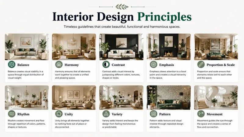

Interior design and graphic design may work on different surfaces, but they solve many of the same problems. Both disciplines organize space, guide attention, balance color, and create an experience that feels intentional. A well-designed room helps people understand where to look, move, and gather, while a strong graphic layout guides readers through information in much the same way. By borrowing practical ideas from interiors, designers can create graphics that feel more balanced, useful, and visually connected.
How Does Balance Make Graphic Design Feel More Comfortable?
Walk into a thoughtfully designed living room and the arrangement usually feels stable. A large sofa might sit opposite two smaller chairs. A substantial coffee table may anchor the center, while lamps and accessories distribute visual weight around the room. Interior designers call this balance, or the way visual weight is distributed across a space.
Graphic designers work with the same principle. Instead of sofas and tables, they balance headlines, photographs, illustrations, text, buttons, and empty space. A large image on one side of a layout might need a bold headline or several smaller elements on the other side to keep the composition from feeling lopsided.
Balance does not require symmetry. In fact, asymmetrical layouts often feel more modern and energetic. The important point is that every visual element has weight. Size, color, contrast, texture, and position can all make an object appear heavier or lighter.
For example, a small bright-red shape can compete visually with a much larger pale-gray photograph. Designers should therefore judge balance by how elements attract attention rather than by their physical dimensions alone.
Key takeaway: Treat a graphic like a room. Distribute visual weight so that one area does not overpower everything around it.
What Can Graphic Designers Learn From Interior Design Hierarchy?
Most successful rooms have a focal point. It might be a fireplace, a large window, a dramatic piece of artwork, or a distinctive dining table. The focal point gives the eye somewhere to begin before smaller details become noticeable.
Visual hierarchy is the arrangement of elements according to their importance. It tells viewers what they should notice first, second, and third.
Graphic design needs this hierarchy even more because readers often scan content before deciding whether to engage with it. A poster, social graphic, website header, or advertisement should not make every element compete for first place.
When you make a banner, for example, think about it as though you were arranging a room around one important feature. The main message can serve as the focal point. Supporting copy should have less visual weight, while a call to action can provide a clear next destination.
You can create hierarchy through:
- Size, with larger elements receiving more attention
- Contrast, using differences in lightness, color, or weight
- Position, especially prominent top or central locations
- Typography, including differences in font size and weight
- Spacing, which can isolate important information
- Color, particularly when one accent stands apart from the palette
The goal is not simply to make important text bigger. It is to build a clear route through the composition.
For more inspiration on how furnishings, colors, and focal features work together in real spaces, readers can explore the interior design and home styling ideas across Pro Home Style.
Key takeaway: Give every graphic a focal point, then use size, contrast, position, and spacing to lead viewers toward supporting information.
Why Is Negative Space as Important as Open Space in a Home?
Interior designers rarely fill every available corner with furniture. A room needs clear paths and open areas. Without them, even attractive furniture can make the space feel cramped.
Graphic designers call the equivalent negative space, also known as white space. It is the unoccupied area surrounding text, images, icons, and other design elements. Despite the name, negative space does not need to be white.
Key takeaway: Negative space is functional empty space that separates elements, improves clarity, and gives important content room to stand out.
One common design mistake is trying to use every available pixel. This often happens when a graphic needs to contain several messages, a logo, images, contact information, and calls to action. Adding more content can seem useful, but excessive density makes information harder to scan.
Instead, ask what could be removed. Increase margins around headlines. Add space between unrelated groups of information. Keep decorative details away from essential text.
The same idea explains why a carefully styled shelf often looks better with five meaningful objects than with twenty unrelated accessories. Restraint creates emphasis.
Key takeaway: Empty space is part of the design, not unused capacity. Use it to separate ideas and strengthen the elements that matter most.
How Can Interior Color Theory Improve Graphic Design?
Color changes how a room feels before someone notices individual pieces of furniture. Warm earth tones can create one impression, while cool neutrals and crisp contrasts create another. Graphic design relies on the same immediate response.
A useful approach is to think of colors as having jobs. Interior designers often work with a dominant color, supporting colors, and smaller accents. Graphic designers can adopt a similar system instead of choosing several equally strong colors.
For example, a home-inspired graphic might use a soft cream background, deep green for major headings, warm brown for secondary elements, and a restrained terracotta accent for buttons or key details. The palette feels coordinated because each color has a role.
Contrast also matters for accessibility. Attractive color combinations do not automatically produce readable text. The Web Content Accessibility Guidelines from W3C explain minimum contrast requirements for readable digital text.
Designers should therefore test color choices for both appearance and function. A muted beige-on-white combination may look sophisticated on a mood board but become difficult to read on a screen.
Key takeaway: Build a color palette with clear roles, then check contrast to make sure visual harmony does not come at the cost of readability.
What Does Furniture Placement Teach Us About Layout?
Furniture placement determines how people move through a room. A sofa can encourage conversation, while a badly positioned table can interrupt a walkway. Graphic layouts also create paths, although the movement happens with the viewer’s eyes.
A grid works much like a floor plan. It establishes invisible boundaries that help designers decide where elements belong. Columns, margins, alignment points, and consistent gaps create order without becoming part of the finished visual.
This does not mean every graphic must look rigid. Interior designers sometimes angle a chair or position an accent table slightly outside the dominant arrangement to create interest. Graphic designers can also break a grid deliberately. However, breaking an established structure is more effective than having no structure at all.
When planning a layout, try this simple process:
- Identify the main message or visual.
- Establish margins around the design.
- Divide the available space into a basic grid.
- Group related content together.
- Align elements that have a visual relationship.
- Introduce one deliberate variation if the layout needs energy.
- Review the final design at both full size and thumbnail size.
If the graphic still communicates clearly as a thumbnail, its basic structure is usually doing its job.
Key takeaway: Use grids like floor plans. They organize visual movement and make deliberate exceptions more effective.
How Can Texture Add Character Without Creating Clutter?
Texture gives interiors depth. Wood grain, linen, stone, woven fabric, metal, and painted surfaces prevent a room from feeling flat. In graphic design, texture can serve a similar purpose.
Digital texture may appear as grain, paper effects, subtle gradients, patterns, shadows, or photographic details. These additions can make graphics feel tactile and support a particular style. A natural-material texture, for instance, can reinforce content about interiors, gardening, craftsmanship, or sustainable living.
However, texture works best when it supports rather than competes with information. A heavily patterned background behind small text is the graphic equivalent of putting several bold wallpapers, patterned rugs, and colorful fabrics in one small room.
Use texture selectively. It might belong in the background, inside a large shape, or around a focal image. Keep important text areas comparatively calm.
Key takeaway: Texture should add depth and personality without interfering with the message or reducing readability.
Why Does Repetition Create a More Cohesive Design?
Interior designers repeat shapes, materials, finishes, and colors to connect different areas of a home. Brass handles might relate to brass lighting fixtures, while the same wood tone appears in furniture across several rooms.
Graphic designers can use repetition to build the same sense of cohesion. Repeated colors, corner shapes, icon styles, typography rules, line weights, and spacing patterns make separate elements feel as though they belong together.
This is especially useful when creating a series of graphics. Instead of designing every image from scratch, establish a small visual system. Keep headline treatments, margins, accent colors, and image styles consistent while changing the actual content.
Consistency should not become monotony. Just as every room in a house does not need identical furniture, every graphic does not need the same exact composition. Repeating core visual cues is enough to establish a relationship.
Key takeaway: Repeat a few deliberate visual features to create consistency while leaving enough flexibility for each design to have its own purpose.
How Can Scale and Proportion Improve Visual Impact?
A large pendant light above a tiny dining table can feel awkward. So can a small rug floating in the middle of a large living room. These examples show the importance of scale and proportion, which describe how the sizes of elements relate to their surroundings and to one another.
In graphic design, scale is a powerful communication tool. An oversized headline creates confidence and urgency. A large photograph can establish mood. Small supporting text can signal secondary information.
Problems occur when the differences are too subtle. If a headline is only slightly larger than body text, viewers may struggle to understand the hierarchy. Designers should create meaningful contrast between major and minor elements.
Scale can also create drama. A cropped close-up photograph, enormous number, or single oversized word can become the visual equivalent of a statement piece in a room. The technique works because one dominant feature is given room to lead.
Key takeaway: Use clear differences in scale to establish importance. Strong proportions make a layout easier to understand and more visually memorable.
How Can You Apply Interior Design Thinking to Your Next Graphic?
You do not need professional interior design experience to use these principles. The easiest method is to review a graphic as though it were a physical room.
Before exporting the design, use this checklist:
- Is there one obvious focal point?
- Does the composition feel visually balanced?
- Is there enough negative space around important elements?
- Do the colors have clear roles?
- Is text easy to read against its background?
- Are related items aligned or grouped together?
- Does texture support rather than distract from the message?
- Are repeated styles creating consistency?
- Does scale clearly show what matters most?
- Can anything unnecessary be removed?
This approach is particularly useful when you need to make a banner, design a social post, create a blog graphic, or develop a website hero image. Rather than decorating an empty canvas, you start by organizing a visual environment around its purpose.
Key takeaway: Before finishing a graphic, review it like a room and check its focal point, balance, spacing, color, flow, and unnecessary clutter.
Frequently Asked Questions
What interior design principle is most useful for graphic designers?
Visual hierarchy is one of the most useful because it establishes what viewers notice first and what they should explore next. Balance, spacing, color, and scale all help create that hierarchy.
In short: Strong hierarchy gives viewers a clear path through a design.
Is negative space always white?
No. Negative space means an area without important content, not an area that must literally be white. It can be any color, photograph, gradient, or subtle texture as long as it provides visual breathing room.
In short: Negative space is defined by its function, not its color.
How many colors should a graphic design use?
There is no universal number. A small, controlled palette is often easier to manage than many competing colors. Start with a dominant color, one or two supporting tones, and an accent where appropriate.
In short: Use enough colors to create hierarchy and interest, but give every color a clear purpose.
Can asymmetrical graphic designs still feel balanced?
Yes. Asymmetrical balance uses different elements with comparable visual weight. A large neutral photograph, for example, might balance several smaller but more colorful elements.
In short: Balance depends on perceived visual weight, not identical placement.
Why should graphic designers study interiors?
Interior design provides practical lessons about arranging space, controlling attention, combining colors, creating focal points, and removing clutter. Those same decisions appear in almost every graphic layout.
In short: Interiors offer a real-world model for understanding how individual design elements work together.
Conclusion: Design the Canvas Like You Would Design a Room
Interior and graphic design share a fundamental goal: they organize elements so people can understand and enjoy an experience. Balance creates stability, hierarchy directs attention, negative space prevents clutter, and color establishes relationships. Texture, repetition, scale, and proportion then give the design character.
The next time you open a blank canvas, imagine that you are entering an empty room. Decide what deserves to become the focal point. Give important elements enough space, create a clear path through the information, and remove anything that does not serve the purpose. When every element has a role, graphic design becomes clearer, more cohesive, and more useful.
Key takeaway: Better graphic design is not about filling space. It is about organizing space with purpose, using balance, hierarchy, color, proportion, and restraint to guide the viewer.